BRAND: WellzyPerks.com
CLIENT: Jared Koch, CleanPlates Founder & CEO
BACKGROUND: Jared and his family’s own health challenges inspired him to launch CleanPlates in 2007, the first digital media brand dedicated to personalized nutrition and clean living. From that, he has joined over half a million people eat more whole foods (and less junk!)
As Jared's family grew, he discovered it was harder to manage a lifestyle that's healthy for him and the planet they'll inherit.
ACTION: In 2022, Jared created a vision for an ethical, wellness live style community. We quickly joined the team.
came up with WellzyPerks, your one source for ethical, sustainable brands you can trust — at values you can't find anywhere else.
We focused on a vision “your one source for ethical, sustainable brands you can trust — at values you can't find anywhere else.” It quickly became a new brand positioning, name, logo and brand design system.
We then moved from the design system to the website layout. Our work influenced website architecture, layout, images, textures and copy. The completion ended at the start of the website launch.
DELIVERABLES: Brand Positioning, Name, Logo, Design System, Brand Guidelines, Website Architecture, Website Layout Pages, Copy, Images and Short Video.
LEARN MORE: www.wellzyperks.com
ROLE: Michael Thibodeau - creative director and brand designer working in tandem with Vicki Lesser.
BRAND: Biophilia Herbals
CLIENT: Jude Luth, Founder & CEO
BACKGROUND: Jude has developed herbal products since 2010. As the products have grown, Jude has decided to greate a new online store.
ACTION: In 2020, I joined with Biophilia Herbals. It become clear to grow as an online store, as well as other local stores, groceries (Whole Food, etc.) and online stores (Amazon, etc.).
We went through through from soup to nuts. I have reorganized the brand positioning, logo, sub-logo products, packages, legal product information and website.
DELIVERABLES: Brand Positioning, Logo, Sub-Logos Products, Design System, Brand Guidelines, Print Production Files, Print Production Packages, Website Architecture, Website Layout Pages, Copy and Images.
LEARN MORE: www.BiophiliaHerbals.com
ROLE: Michael Thibodeau - creative director and brand designer.
BRAND: Marfa
CLIENT: The City of Marfa
BACKGROUND: Marfa, Texas, was born in the late 1800s. It was a farm and industry location close to the edce of Mexico. I the 1970s, the artist Donald Judd purchased 340 acrers in Marfa, to create the largest minimalism art factory. He brought in thousands of other artists throughout the world, including John Chamberlain, Dan Flavin and Bridget Riley, Richard Long and Claes Oldenburg.
After he passed, his family created Chinati Foundation. All there many visitors, Marfa has slowly declined for community.
ACTION: The City of Marfa (as well as many other small towns) had never had a brad logo. The city felt that it should make its life culture alive, bringing more visitors and setters.
In 2020, I was chose as the brand designer. My program included research, brand logo, design system, font family and example layouts. I also supported the website developers.
The program solution created a link between minimalism art, industrial factories and simplistic communities. The solution focused on black, white, gray and silver colors and the hand-made industrial font.
OUR TEAM’S DELIVERABLES: Logo, Design System and Font Family
LEARN MORE: www.VisitMarfa.org
ROLE: Michael Thibodeau - creative director and lead designer
BRAND: Enchantment Resort, Sadona, AZ
CLIENT: Enchantment Group
BACKGROUND: Enchantment Resort is a luxury collection within Enchantment Group.
ACTION: For more than 4 years, I have worked together for Enchantment Resort.
DELIVERABLES: Advertising, both printed and online, customer communications, online services and online videos.
LEARN MORE: www.enchantmentresort.com
ROLE: Michael Thibodeau - creative director and brand designer.
BRAND: Plainsight
CLIENT: Plainsight
BACKGROUND: Sixgill is an AI innovation service to market automotive, agriculture, healthcare, supply chain, pharmaceuticals, manufacturing, consumer and CPG, construction, transportation, government, and more. The AI services can accelerate services in a manner that is complete, accurate and accessible to non-technical business leaders.
ACTION: The AI services are growing, but Sixgill brand did popular for potential current and new customers. With that, Sixgill decided to reorganize their brand and empower their consumer relationship.
In 2021, I and Hudson Cutler (see www.hudsoncutler.com) joined Sixgill. We quickly went through and find the future brand point. We will then develop brand positioning, name, logo, design system and a new website layout. We felt that the company should grow the brand, change the name and desirable customer experiences.
“Now as Plainsight, we have established ourselves as a power player delivering production-ready vision AI solutions. Industry leaders have recognized Plainsight for solving problems where others have failed, and for helping customers see and activate the potential of their data through smart, simple, and effective use of vision AI.” - Carlos Anchia, CEO of Plainsight.
DELIVERABLES: Brand positioning, Logo, Design System, Icons, Communications, Website Layout Pages and Launch Support.
LEARN MORE: www.plainsight.ai
https://plainsight.ai/blog/the-evolution-of-vision-ai-and-the-company-seeing-it-into-the-future
ROLE: Michael Thibodeau - creative director and brand designer and Hudson Cutler, NYC.
BRAND: The Glenrothes
CLIENT: Edrington
BACKGROUND: The Glenrothes was created in 1879. It is one of the highest luxury whisky sets. The Glenrothes 12 Year Old bottle is $70.00 and The Glenrothes 50 Year Old bottle is $36,000. Very expensive stuff!
ACTION: In 2021, I and Hudson Cutler (see www.hudsoncutler.com) helped The Glenrothes to increase luxury customers through “Whisky & Truffle Pairings.”
“Like a rare dram of single malt, coming across the ideal truffle may take patience. The term foraging equally applies to both pursuits. This quite natural connection gives rise to something original for The Glenrothes: its first curated guide to truffle hunting; a roadmap to discovering truffles, whether plated or in the wild, in the U.S. and across the pond, during peak fall and winter seasons.
Each featured destination – whether an acclaimed restaurant known for truffle mastery on the menu, or a wooded hunt into the wild – promises to reward one’s inner forager.” - The Glenroths.
We created “The Guide to Truffle Hunting” and new images at The Glenrothes front homepage. A new page provided information and links for customers to explore. There are follow-up marketing and events.
DELIVERABLES: Marketing Communications, Images & Website.
LEARN MORE: www.theglenrothes.com
https://www.theglenrothes.com/en-us/the-glenrothes-guide-to-truffle-hunting
ROLE: Michael Thibodeau - creative director and brand designer and Hudson Cutler, NYC.
BRAND: The Tides Inn, Irvington, VA
CLIENT: Enchantment Group
BACKGROUND: The Tides Inn is a luxury collection within Enchantment Group.
ACTION: For more than 4 years, I have worked together for The Tides Inn resort. I have supported online and print production communications. The Tides Inn is a unique, historical resort at the coastline center of the Chesapeake.
DELIVERABLES: Advertising, both printed and online, customer communications, online services and online videos.
LEARN MORE: www.tidesinn.com
ROLE: Michael Thibodeau - creative director and brand designer.
BRAND: The Cove, Eleuthera, Bahamas
CLIENT: Enchantment Group
BACKGROUND: The Cove is a luxury collection within Enchantment Group.
ACTION: For more than 4 years, I have worked together for The Cove. I have supported online and print production communications. The Cove is an extreme fantasy resort at the core of the Bahamas.
DELIVERABLES: Advertising, both printed and online, customer communications, menus, brochures and online services.
LEARN MORE: www.thecoveeleuthera.com
ROLE: Michael Thibodeau - creative director and brand designer.
BRAND:
Turvo
CLIENT:
Turvo Inc.
BACKGROUND:
Turvo is the world’s first multi-enterprise collaborative platform specifically designed for the global supply chain. The platform connects people and organizations across the supply chain, allowing shippers, logistics providers and carriers to digitally transform their workflows with cloud-based software and mobile applications.
ACTION:
Transform the technology platform into a powerful brand and strengthen communication experiences. Create a new brand system, showcase unique isometric images and textures.
Results: Turvo’s brand has increased global customers and empowered business growth.
OUR TEAM’S DELIVERABLES:
Research, Design System, Brand Guidelines, Brand Icons, Isometric Logistic Icons, Campaign
LEARN MORE:
www.turvo.com
ROLE:
Michael Thibodeau - creative director and lead designer
BRAND: Mii amo, Sadona, AZ
CLIENT: Enchantment Group
BACKGROUND: Mii amo is a luxury spa collection within Enchantment Group. It is considered one of the top 10 throughout the country.
ACTION: For more than 4 years, I have worked together for Mii amo.
DELIVERABLES: Online advertising and customer communications.
LEARN MORE: www.miiamo.com
ROLE: Michael Thibodeau - creative director and brand designer.
BRAND:
edX
CLIENT:
Harvard University & MIT
BACKGROUND:
Massive Open Online Courses (MOOC) is an online service providing classes for students through the web. Once MOOC was developed, many universities wanted to launched online class services. MIT was one of the first and joined forces with Harvard University to assist students and professors by providing online tools. Harvard University & MIT wanted to launch ASAP, however, there was no exsiting brand.
ACTION:
We researched MOOC classes and worked through many brand domain names options. It was extremely important to create a brand that was visibly appealing and memorable to multiple linguistic cultures. Harvard University & MIT selected “edX,” for “Education & Exchange.” We developed many logo options, creating a “Less is More” direction to simplify the process for users. This new brand needed to feel like a future platform service. Our solution included a brilliant brand logo and pure brand guidelines. We would showcase the new brand via colors, fonts and textures for all marketing communication vehicles, signage and the digital site. Harvard University & MIT launched worldwide through social media marketing, connecting edX courses quickly with new users.
DELIVERABLES:
Brand Strategy, Name, Logo, Design, Digital, Brand Guidelines, Marketing Communications & Launch
RESULT:
In two years, edX has grown more than 3 million worldwide users, 60 universities and over 300 courses online.
LEARN MORE:
www.edX.org
www.youtube.com/watch?v=7pYwGpKMXuA
www.youtube.com/watch?v=MJZN700YS0o
ROLE:
Michael Thibodeau - creative director and brand designer working in tandem with Weber Shandwick.
BRAND:
Geir Ness
CLIENT:
Laila Inc.
BACKGROUND:
As it turned out, Laila was just the beginning. Today Laila is one of Nordstrom’s best-selling specialty fragrances, and the flagship product in a full complement of fragrance and body product lines including Geir for Men, Skin of Norway and Frozen in a Bottle, a fragrance that Geir created in partnership with Disney, inspired by the Norwegian nature featured in Disney’s “Frozen.”
ACTION:
Review the website, blogs and sales. Research other luxury perfume brands. Provide a better digital system, simplifying communications and strengthening relationships. Use Shopify as a supporting solution. Update the Geir Ness logo and clean up all sub-brand logos.
The website launch has shown more than 30% more sales since the past.
DELIVERABLES:
Brand Name Options, Brand Logo, Design System, Digital Design System, Marketing Communications and Launch
LEARN MORE:
www.GeirNess.com
ROLE:
Michael Thibodeau - creative director and lead designer working with Geir Ness, Laila Inc, Hudson Cutler & Be Fun Bully
BRAND:
KRC Research
CLIENT:
KRC Research and Weber Shandwick
BACKGROUND:
KRC Research is a full service global public opinion research consultancy and a member of the Interpublic Group (IPG) of companies.
ACTION:
We assisted KRC Research to reorganize the brand from the core, and changed the strategy, logo, design system and marketing communications. The design system simplified the website and new reports, decks and services. Sub-brand services expanded the relationship, making the KRS Research family.
DELIVERABLES:
Brand Strategy, Logo, Sub-Brand Logos, Design, Digital, Brand Guidelines, Marketing Communications, Launch
LEARN MORE:
www.KRCResearch.com
ROLE:
Michael Thibodeau - creative director and brand designer in conjunction with KRC Research and Weber Shandwick.
BRAND:
Umami Burgers
CLIENT:
SBE / C3
BACKGROUND:
Before the COVID-19 pandemic upended the restaurant industry, SBE Entertainment Group began developing chef-driven delivery-only brands to tap into the growing food on-demand segment.
SBE Entertainment Group supports their hotels by turning dark restaurant kitchens into “ghost kitchens.” That’s always been part of the company’s strategy. There will be a greater void if more restaurants close permanently due to the pandemic.
“It's a solution that will generate revenue in a manner that can deal with the demand that we see today during COVID-19 and the demand that we're going to see post COVID.” Nazarian said.
ACTION:
Umami Burger is one of SBE’s growing sub-brands. In order for the sub-brand to grow, they were in need of consistent guidelines in their communications.
I created the menus, billboards, posters and graphic stickers.
DELIVERABLES:
Design, Signage, Environment, Marketing Communications
LEARN MORE:
www.sbe.com/restaurants/umami-burger.com
ROLE:
Michael Thibodeau - creative director and designer working with SBE / C3
BRAND:
UPS
CLIENT:
United Parcel Service, Inc.
BACKGROUND:
UPS is the global leader in logistics and shipping worldwide. Although the business model had grown, the marketing had stayed the same. In order to move the marketing and brand forward, a plan was necessary to restructure the brand strategy.
ACTION:
We pulled back and provided internal and external research. The conclusive result was that change was needed, including the brand name (United Parcel Service vs. UPS), logo (from 1961) and brand architecture. We conducted focus groups with consumers and business owners to review simple marketing experiences and communications. The decision was to simplify and create a clear and powerful brand look for UPS, making communications simple for future global solutions.
This included establishing a new brand strategy, positioning, messaging and a new tagline, “Synchronizing the World of Commerce,” We simplified the brand architecture system, focusing on one brand, one vision. The new UPS logo created was more masculine, active and powerful. The design system added a new font and palette. Inventory impacted included stationery, collateral, signage, vehicles, planes and packages. Even the 4,300 stores Mail Box Etc. become the The UPS Store.
The UPS CEO, Mike Eskew, unveiled the new brand including the new logo and touchpoint design system. Being the first redesign in more than 40 years of the company’s famous logo, a string-tied package on top of a shield.
DELIVERABLES:
Research, Brand Strategy, Brand Architecture, Name, Logo, Tagline, Design, Digital, Brand Guidelines, Packages, Signage, Vehicles, Internal Communications & Launch
RESULT:
In a year, UPS reported 13% earnings, increasing on 7% revenue gain through all segments. “D. Scott Davis, the chief financial officer, said the company was performing better than the rest of the economy. He also credited a rebranding initiative for increasing profit.” – The New York Times
LEARN MORE:
www.UPS.com
ROLE:
Michael Thibodeau - creative director and lead designer, working with FutureBrand, Martin Agency, IPG, McKinsey & Co., Sapient and United Parcel Service, Inc.
BRAND:
IngenioRx
CLIENT:
Anthem, Inc.
BACKGROUND:
Anthem, one of the nation’s largest health benefits companies, announced it was establishing a new pharmacy benefits service.
ACTION:
Create a new name and logo, IngenioRx. IngenioRx quickly offered a full suite of PBM solutions starting in 2020, which coincides with the conclusion of the company’s current PBM contract. IngenioRx will serve customers of Anthem affiliated health plans, as well as non-Anthem customers, with a seamless, integrated experience by taking Anthem’s new model to the national marketplace.
“As a company, we continuously seek bold, innovative solutions that achieve consumer access to high quality, affordable healthcare,” said Joseph R. Swedish, Chairman, President and Chief Executive Officer, Anthem. “During the past two years, we have been very clear that we can strengthen the value offered to the marketplace with an improved and aligned PBM model. Through the process of evaluating many PBM options in preparation for the expiration of our current contract, we determined that our scale and experience best position us to deliver an innovative solution, and the launch of IngenioRx will allow us to break through what is now a complex and fragmented landscape. It also positions Anthem to take advantage of a unique opportunity to grow and diversify our business within our existing footprint as well as nationally.”
DELIVERABLES:
Brand Strategy, Name, Logo, Design, Digital
LEARN MORE:
www.Ingenio-Rx.com
ROLE:
Michael Thibodeau - creative director and designer working with Anthem and Lippincott
BRAND:
Climate Victory Gardens
CLIENT:
Green America
BACKGROUND:
Green America is a nonprofit membership organization based in the United States that promotes environmentally aware and ethical consumerism. It develops events and campaigns to make ethical actions visible and memorable.
As a recent climate campaign, Green America developed Climate Victory Gardens. It helps people as their part of the climate solution by restoring soil health to draw down carbon. Everyone can grow a garden, and everyone can take meaningful action on the climate crisis.
ACTION:
Develop a campaign for communications and experiences. Include logo, design system and basic items.
Results: The campaign has grown new donators and developed more than 8,000 gardens.
“Michael was very patient with our feedback and requests. In the end, he gave us a great logo. Thank you!!!” – GreenAmerica.org
OUR TEAM’S DELIVERABLES:
Logo, Design System, Campaign Applications
LEARN MORE:
www.greenamerica.org/cvg
ROLE:
Michael Thibodeau - creative director and lead designer
BRAND:
Make The NetWork
CLIENT:
GSMA
BACKGROUND:
The Open Internet is critical to the development of society as a whole. The European electronic communications industry is at the forefront of its development and invests heavily in quality networks and services, in the context of highly competitive markets.
ACTION:
As work on the “Connected Continent Regulation” evolves, we underline the importance of promoting real choice and quality for all customers. To control consumers, we helped GSMA develop Make The NetWork supporting EU consumers and leading telecommunications. As result, it advocates a healthy, thriving digital economy as crucial to social and economic progress in Europe before the 5G.
DELIVERABLES:
Brand Strategy, Name, Logo, Design, Digital, Marketing Communications, Launch
LEARN MORE:
www.MakeTheNetwork.eu
Twitter: @MTNWEurope
ROLE:
Michael Thibodeau - creative director and brand designer working in tandem with Weber Shandwick and GSMA
BRANDS: Arizona Biltmore: Celebrating 90th Years
CLIENT: Arizona Biltmore, A Waldorf Astoria Resort
BACKGROUND: Arizona Biltmore, A Waldorf Astoria Resort, is a historical resort inspired by architect Frank Lloyd Wright. It is known as the “Jewel of the Desert” a playground for the rich and famous. Almost every U.S. President has been a guest, Clark Gable and Carole Lombard honeymooned there as well as Ronald and Nancy Reagan. Irving Berlin composed the lyrics to “White Christmas” at the resort in 1939.
ACTION: In 2019, Arizona Biltmore celebrated its 90th anniversary year.
DELIVERABLES: Logo
LEARN MORE: https://www.arizonabiltmore.com/special-offers/90years/
ROLE:
Michael Thibodeau - graphic designer
BRAND:
1-800-NoCuffs
CLIENT:
Kavinoky Law Firm
BACKGROUND:
1-800-NoCuffs is the largest California DUI defense law firm.
ACTION:
Kavinoky Law Firm was growing and adding other services in California. Finding the right defense lawyer within the firm is paramount. As a result, 1-800-NoCuffs wanted to rebrand their services.
OUR TEAM’S DELIVERABLES:
Brand Architecture, Logo, Design, Digital, Stationery, Marketing Communications
LEARN MORE:
www.nocuffs.com
www.youtube.com/channel/UCkAyB_BYvntBh_IPx1LInXA
ROLE:
Michael Thibodeau - creative director and lead designer working with Kavinoky Law Firm and Leonard & Co.
BRANDS:
Marriott Hotels & Resorts, Marriott Conference Centers & Marriott Apartments
CLIENT:
Marriott International
BACKGROUND:
Marriott International is the leader hospitality worldwide, managing a portfolio of over 6900 hotels.
Marriott was growing quickly, however, the brand family had lagged through marketing and experiences.
ACTION:
Meeting with the Vice President Global Marketing, Global Marketing & Sales and Mr. J.W. Marriott, Jr. and walked through a proposal to relaunch the marketing management. It was an approved development for the Marriott, JW Marriott and C-F-R-S-T brands, Marriott Rewards and support second tier brand services.
This involved many different brands, sub-brands, services and products. The goal was to simplify brand architecture.
The result would be mindful of Marriott Rewards and support one go-to website for all brands. A massive project creating a big impact.
“When anyone, anywhere sees the name ‘Marriott’ and believes it ensures a standard of quality, integrity and dependability, that’s an act of trust. We have built trusted brands over 75 years, and today we earn that trust with everything we do.” – J.W. Marriott, jr.
DELIVERABLES:
Analysis, Brand Architecture, Brand Strategy, Research, Logos and Sub-Logos, Design, Digital, Design System, Brand Guidelines, Stationery, Signage, Vehicles, Marketing Communications, Launch
LEARN MORE:
www.Marriott.com
ROLE:
Michael Thibodeau - creative director, strategist and lead manager working with Marriott International, FutureBrand, McCann-Erickson Worldwide
BRAND:
Bob & Dolores Hope Foundation and Bob Hope Legacy
CLIENT:
The Hope family
BACKGROUND:
The Bob & Dolores Hope Foundation supports organizations that bring “hope” to those in need, and those who served to protect our nation.
ACTION:
Bob Hope took his talents to the center of a crisis and used them to heal by showing his compassion, empathy, uplifting spirit and respect for his country. In order to reach and assure continuation of these goals, Bob & Dolores Hope provided direction and leadership of the Foundation during their lifetime.
OUR TEAM’S DELIVERABLES:
Logo, Digital Initiatives and Web Design, Marketing Communications, Launch
LEARN MORE:
www.BobHope.org
ROLE:
Michael Thibodeau - creative director and lead designer
BRAND:
UpValley Inn & Hot Springs
CLIENT:
UpValley Inn & Hot Springs
BACKGROUND:
Hotel owner wanted to reposition the Calistoga property from a Comfort Inn to a higher-end boutique hotel. Realizing that Napa hotels were growing share and he was beginnning a renovation, the inn needed a brand transformation to elevate every guest and employee experience.
ACTION:
The new brand yearned for a unique name, one that was simple, memorable and interesting. The hotel was debuting a mid-century modern vibe, using bold colors and textures. Messages and images would tout tongue-in-cheek marketing communications. The project included all touchpoints.
DELIVERABLES:
Brand Strategy, Logo, Design, Digital, Signage, Stationery, Brand Guidelines & Marketing Communications
LEARN MORE:
www.upvalleyinn.com
ROLE:
Michael Thibodeau - creative director and brand designer working with UpValley Inn & Hot Springs and Andrew Freeman & Co
BRAND:
Fisher-Price
CLIENT:
Mattel Inc. and Fisher-Price
BACKGROUND:
Fisher-Price promotes educational toys for children and infants. After receiving deep data, Fisher-Price reorganized, focusing on all things social & emotional, cognitive development and physical development.
ACTION:
Create a sub-brand for Fisher Price Baby and develop new guidelines supporting online services.
DELIVERABLES:
New Brand Strategy, Sub-Brand Logos, Icons, Design, Digital, Brand Guidelines, Marketing Communications, Campaigns
RESULT:
Fisher-Price drove 8% growth in 2016.
LEARN MORE:
www.Fisher-Price.com
https://vimeo.com/93183680
https://vimeo.com/93183557
ROLE:
Michael Thibodeau - creative designer with Weber Shandwick and Fisher-Price
BRAND:
NXP
CLIENT:
Philips
BACKGROUND:
The largest technology spinout to private investors of Philips Semiconductors from Philips Electronics.
ACTION:
Help Philips create a new name, iconic logo and supporting design system, digital site, fresh and relevant marketing communications and launch for NXP. The new brand, NXP, produces chips for consumer electronics devices, using the "superior sensory experience" through mobile phones, digital TVs and such through its "vibrant media technologies."
"The logo symbolizes everything NXP stands for. It's colorful, fresh and dynamic. The N&P on top of the X create two arrows facing inwards - so the N (representing the New) and P (representing Philips) point towards the X, which stands for the sensory experiences that will be enhanced through NXP products." - Philips Design
DELIVERABLES:
Brand Strategy, Brand Positioning, Name, Logo, Design, Digital, Marketing Communications & Launch
LEARN MORE:
www.NXP.com
ROLE:
Michael Thibodeau - creative director and lead designer working with Philips, Philips Design and Verse Group
BRAND:
The Executive Council
CLIENT:
The Executive Council
BACKGROUND:
The Executive Council was designed to give B2B marketers accelerated access to key prospects via highly-curated, private events.
ACTION:
Catapult the brand from good to great, simplify website and marketing communications. Create a new iconic logo, design system and digital site and relaunch the business. As a result, in 24 months, The Executive Council excelled in the Leadership Events to be a successful business model with tremendous opportunities for expansion.
“I have worked with Michael for over five years and he’s an impeccable designer. He’s timely, has an affable and friendly manner and his focus on quality is in the top 1% of designer we’ve hired over many years. He has a fantastic aesthetic when it comes to thinking about positioning and communicating a brand to an audience. He’s a brilliant creative mind!" – Bob Johnston, CEO, The Executive
DELIVERABLES:
Brand strategy, Logo, Design, Digital, Marketing Communications
LEARN:
www.ExecCouncil.org
ROLE:
Michael Thibodeau - creative director and leader designer
BRAND:
HarvardX
CLIENT:
Harvard University
BACKGROUND:
As edX become a huge success, Harvard University knew that HarvardX could become even a greater power.
ACTION:
Assisted in creating a powerful brand strategy, a new logo for HarvardX, design system and supporting online communications and website. Currently there are more than 1.5M+ enrollments worldwide.
DELIVERABLES:
Brand Strategy, Name, Logo, Design, Digital, Brand Guideline, Marketing Communications, Launch
LEARN MORE:
https://harvardx.harvard.edu
ROLE:
Michael Thibodeau - creative director and brand designer with Weber Shandwick and Harvard University
BRANDS:
Mondee & TripPro
CLIENT:
Mondee, Inc.
BACKGROUND:
Mondee is a travel enterprise, providing private fares and services for travel agencies, tour operators and other distributors. IT developed a next generation platform, however, it was necessary to reach and impress existing and new members.
ACTION:
Organized the brand strategy and connected to the next generation platform by creating a new brand family, developing new logos, design systems and messages. The new design system allowed Mondee and TripPro to grow.
DELIVERABLES:
Brand Strategy, Logos, Design Design, Digital Design
RESULT:
TripPro brand communications and experiences resulted in new partnerships (ex: Sabre and Amadeus).
LEARN MORE:
www.TripPro.com
www.Mondee.com
www.youtube.com/watch?v=ga2_gcGuts0
www.youtube.com/watch?v=nGJCSvQVLVI&app=desktop
ROLE:
Michael Thibodeau - creative director and brand designer with Weber Shandwick and Mondee
BRAND:
Live. Love. Lux.
CLIENTS:
Electrolux AB and Live. Love. Lux.
BACKGROUND:
Create a digital experience that enables Electrolux to develop a differentiated relationship throughout the purchase cycle, based on target consumer’s lifestyle interests in design, culinary, style, and entertaining.
ACTION:
Created “Live. Love. Lux.”, identity and system. A deeper relationship delivers experience through high-quality editorial content published on a daily basis, informing, surprising and delighting the consumer while building credibility as a premium brand. Live. Love. Lux.
DELIVERABLES:
Brand Strategy, Research, Name, Logo, Design, Digital, Design System, Launch
RESULT:
Launched in US, and now in other countries.
LEARN MORE:
www.LiveLoveLux.com
www.forbes.com
ROLE:
Michael Thibodeau - creative director and brand designer working with Weber Shandwick and Electrolux
BRAND:
Meritage Restaurant
CLIENT:
JW Marriott Desert Ridge Resort & Spa
BACKGROUND:
JW Marriott Desert Ridge Resort set out to update their dining experiences, targeting younger guests, including Gen Z and Millennials.
ACTION:
Develop a new brand strategy, Meritage as “an urban tavern.” Create a new brand logo, system, communications and signage. This brand boost helped Maritage become the new, upscale gathering tavern featuring American fare, creative cocktails, Arizona craft beers and a growler station for take home brews.
DELIVERABLES:
Brand Strategy, Logos, Tagline, Design System, Marketing Communications, products and Signage
LEARN MORE:
www.marriott.com/hotels/travel/phxdr-jw-marriott-phoenix-desert-ridge-resort-and-spa/
ROLE:
Michael Thibodeau - creative director and lead designer
BRAND:
Juan Valdez
CLIENT:
National Federation of Coffee Growers of Colombia
BACKGROUND:
Colombia developed a compelling café concept that would help increase demand for all Colombian Coffee. It provided benefits for the 500,000 Colombian farmers that status the brand, Juan Valdez, elevating the premium coffee-buying customers by keeping in mind everything the Federation does is for the benefit of all coffee farmers. All profits are channeled back to the farmers and their communities. Colombian Coffee historically sells at a premium and provides a higher standard of living for the farmers.
In 2000, although Colombian coffee and Juan Valdez were well-known, over time they become too strongly associated with mass-market brands. The perceived value of Colombian coffee had begun to erode.
ACTION:
Conduct research for the brand, Juan Valdez, and the products. Discover the best way to refresh the brand by adding “Premium” coffee products and services. This new new brand was designed to feel true, rich and upscale. The Juan Valdez “signature” stands for distinction, authenticity and a promise to provide the highest quality coffees.
The result was a new cafe, food, drink offerings and experiences which would establish Juan Valdez as a premium coffee brand, showcase Juan Valdez, helping to re-stage the brand and increase overall demand for all Colombian Coffee. The café was designed to do more than just sell coffee. It also tells the story of Colombian coffee growers.
DELIVERABLES:
Research, Brand Strategy, Names, Logos, Sub-Brand Logos, Design, Brand Guidelines, Environment, Packaging, Digital, Marketing Communications, Campaign, Launch
RESULTS:
The Juan Valdez café concept has become a powerful tool for changing perceptions of Colombian coffee, and increasing awareness of the role of the collective Fedecafé. Within two years of launch, this café concept has been expanded to six additional sites within the United States.
LEARN MORE:
www.JuanValdez.com
ROLE:
Michael Thibodeau - creative director and lead designer working with the National Federation of Coffee Growers of Colombia, FutureBrand and Weber Shandwick
BRAND:
Renaissance Hotels & Resorts
CLIENT:
Marriott International
BACKGROUND:
Marriott International is a leader in hospitality worldwide. Marriott has grown quickly, however, the brand awareness was needing attention to enhance the growth. Met with the Vice President Global Marketing, Global Marketing & Sales and Mr. J.W. Marriott, Jr. and walked through a proposal to relaunch brand.
ACTION:
Restructure the Renaissance Hotels & Resorts brand strategy. Redesign the logo and brand system.
DELIVERABLES:
Analysis, Brand Architecture, Brand Strategy, Research, Logos and Sub-Logos, Design, Digital, Design System, Brand Guidelines, Stationery, Signage, Vehicles, Marketing Communications, Launch
LEARN MORE:
www.Marriott.com/Renaissance
ROLE:
Michael Thibodeau - creative director, strategist and lead designer working in tandem with Marriott International, FutureBrand, McCann-Erickson Worldwide
BRAND:
Chichifoofoo
CLIENT:
Global Executive Pastry Chef, Thierry Delourneaux
BACKGROUND:
The unique Executive Pastry Chef, Thierry Delourneaux, boasts over three decades of experience. In order to simplify his brand name, he created “Chichifoofoo.”
ACTION:
Create Chichifoofoo, into a global identity. Manage the trademark services, logo, icon, and systems.
OUR TEAM’S DELIVERABLES:
Brand Strategy, Logo, Design System, Marketing Communications
LEARN MORE:
www.chichifoofoo.com
ROLE:
Michael Thibodeau - creative director and lead designer
BRAND:
EthicOne
CLIENT:
The Ethisphere® Institute
BACKGROUND:
The Ethisphere® Institute develops new tools to engage employees and customers.
ACTION:
Create a new name, (“EthicOne “), new logo and design systems. Organize website and provide marketing communications.
DELIVERABLES:
Name, Logo, Design, Digital, Marketing Communications
LEARN:
www.EthicOne.com
www.prweek.com
www.ethisphere.com
ROLE:
Michael Thibodeau - creative director, digital and brand designer
BRAND:
Bahamas Investment Authority
CLIENT:
Commonwealth of The Bahamas
DELIVERABLES:
Brand Strategy, Logo, Design. Marketing Communications, Events
ROLE:
Michael Thibodeau - creative director and brand designer working with Weber Shandwick and Commonwealth of The Bahamas
BRAND:
Brigham and Woman’s Hospital
CLIENT:
Brigham and Woman's Hospital & Partners Healthcare
BACKGROUND:
A teaching hospital of Harvard Medical School, Brigham and Women’s Hospital (BWH) is a world leader in every area of medicine, internationally known for treating some of the most challenging and complex cases. This leader was in need of a new polished logo.
ACTION:
Create a new logo to be used in all formats beginning with digital efforts and website. Design secondary website for a new campaign; Life. Giving. Breakthroughs., intended to transform the future of medicine.
OUR DELIVERABLES:
Research, Brand Strategy, Logos, Tagline, Design, Digital, Brand Guidelines, Marketing Communications, Events, Launch
LEARN MORE:
www.brighamandwomens.org
ROLE:
Michael Thibodeau - creative director and brand designer working with Weber Shandwick and Brigham and Woman's Hospital
BRAND:
twenty6
CLIENT:
JW Marriott Desert Ridge Resort & Spa
BACKGROUND:
JW Marriott Desert Ridge Resort was in the market to update the dining experiences targeting younger guests, including Gen Z and Millennials.
ACTION:
Create a new logo and design system, signage and communication. Create wrap for twenty6 signature brand wine and beer bottles.
OUR TEAM’S DELIVERABLES:
Logo, Design, Beer, Wine, Products, Signage, Marketing Communications
LEARN MORE:
www.marriott.com/hotels/travel/phxdr-jw-marriott-phoenix-desert-ridge-resort-and-spa/
ROLE:
Michael Thibodeau - lead creative director and brand designer
BRAND:
Travelport
CLIENT:
Cendant Travel Distribution
BACKGROUND:
Before Cendant could spin off its travel distribution business, it needed a story that would highlight the value of its unique 21 brand portfolio, which included Orbitz, Galileo and GTA.
ACTION:
We began through market research and executive interviews which led to a range of possible stories for the new company. A series of workshops resulted in consensus around the idea of rallying the company around “exceptional travel experiences.”
The name Travelport was selected from Cendant’s existing trademark base, reducing the time and costs typically associated with registering a new name globally. A new visual identity system brought the personality of the company to life. The refreshingly easy tonality and clear, professional look of Travelport communications helped distinguish the brand from competitors while inspiring employees to place greater emphasis on service. We assisted in creating key communications materials to ensure the success of both the employee and public launch of the brand.
“With unmatched global reach, relevance and local expertise, Travelport opens new possibilities and delivers greater value every step of the way. Whether you're a traveler, travel professional or travel supplier, we offer more ways for you to create and enjoy exceptional travel experiences.” - Jeff Clarke, Travelport CEO
DELIVERABLES:
Research, Internal Interviews, Brand Architecture, Brand Strategy, Brand Story, Travelport logo, Orbitz Worldwide logo, updated Galileo logo, Design, Digital, Signage, Marketing Communications & Launch
LEARN MORE:
www.Travelport.com
www.Orbitz.com
ROLE:
Michael Thibodeau - creative director and lead designer working with Cendant Travel Distribution, Orbitz, Travelport and Verse Group.
BRAND:
Mediaco Publish
CLIENT:
Mediaco
BACKGROUND:
Scalable brand publishing, providing seamless collaboration.
ACTION:
Mediaco Publish allows large teams to plan, produce and publish content at speed and scale. It is a workflow that works. Mediaco Publish is a suite of tools that creates efficiencies throughout the entire brand publishing process, from ideation to publication. Create a logo for Mediaco Publish.
OUR TEAM’S DELIVERABLES:
Brand Name Options, Brand Logo, Design System, Digital Design System, Marketing Communications, Launch
ROLE:
Michael Thibodeau - creative director and brand designer working with Mediaco and Weber Shandwick
BRANDS:
JW Marriott Hotels & Resorts
CLIENT:
Marriott International
BACKGROUND:
Marriott International is a leader hospitality worldwide.
JW Marriott has grown quickly, and there was desire to showcase the upscale JW brand.
ACTION:
Met with the Vice President Global Marketing, Global Marketing & Sales and Mr. J.W. Marriott, Jr. and walked through a proposal to relaunch the brand.
Develop a logo and design system using the JW Marriott iconic logo, a griffin symbol, develop the Marriott family font, signage and brand guidelines. Support the website system, images and marketing communications. Elevate the brand.
DELIVERABLES: Analysis, Brand Architecture, Brand Strategy, Research, Logos and Sub-Logos, Design, Digital, Design System, Brand Guidelines, Stationery, Signage, Vehicles, Marketing Communications, Launch
LEARN MORE:
www.Marriott.com/JWMarriott
ROLE:
Michael Thibodeau - creative director, strategist and lead designer working with Marriott International, FutureBrand, McCann-Erickson Worldwide
BRAND:
FirstKey Mortgage
CLIENT:
Cerberus Capital Management and FirstKey Mortgage
DELIVERABLES:
Brand Name Options, Brand Logo, Design System, Digital Design System, Marketing Communications and Launch
ROLE:
Michael Thibodeau - creative director and brand designer working with FirstKey Mortgage, Cerberus Capital Management and Weber Shandick
BRAND:
Acela
CLIENT:
National Railroad Passenger Corporation
BACKGROUND:
Create a branded experience for Amtrak’s high-speed rail service that would differentiate it from airlines and automobiles as well as make it compelling and relevant to customers.
ACTION:
Insights were gathered by riding trains, touring stations, interviewing senior management, and analyzing the ways Amtrak distributes and and acts upon information. In-depth traveler profiles were developed to highlight to role rail travel could play in people’s lives.
A new brand name, “Acela,” story and identity were created to reflect consumers’ image of the ideal rail provider.
Consumer research identified ten key steps in the passenger's journey, from learning and planning through to arriving at the destination and continuing onward. These steps became the basis for Acela’s service strategy. Each step in the journey was seen as part of an integrated whole, allowing for better media planning and touch point design.
Staging included managing the roll-out of the new Acela high speed rail brand – from designing new train exteriors to specifying materials and finished to train interiors. All touch points were designed to reflect the new brand - from tickets to newsletters to website to business cards. By improving the details and consistency at every point of the journey, Amtrak has been able to provide guests a better travel experience.
In its first year of operation, Acela realized a 13% premium and 10% increase in bookings over other train services.
DELIVERABLES:
Research, Brand Strategy, Brand Services, Name, Logo, Icons, Sub-Brand logos, Brand Guidelines, Vehicles, Signage, Maps, Stationery, Marketing Communications, Campaign, Launch
LEARN MORE:
www.amtrak.com/acela-express-train
ROLE:
Michael Thibodeau - creative director and lead designer with IDEO, OH & Co and National Railroad Passenger Corporation
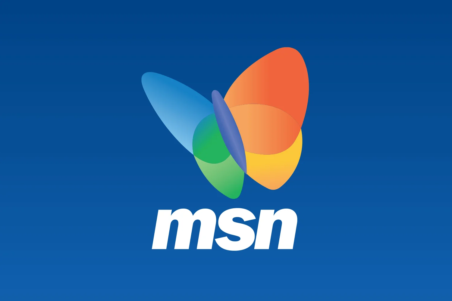
BRAND:
MSN
CLIENT:
Microsoft Corporation
BACKGROUND:
In 2000, Microsoft was empowered with business software users, but consumers shield internet personal services. To gain momentum and grow share, Microsoft’s MSN Internet service needed a stronger, more distinctive brand that would promote awareness among consumers.
ACTION:
Microsoft was going through a legal battle with the US government at the time and Bill Gates. Consumers did not want to use Microsoft for personal experiences. It was a big issue for Microsoft to grow new consumer internet services. “MSN is Bill Gates; serious, commercial, aggressive” “Microsoft is dominate then annihilate.”
The plan created involved massive brand direction, including its largest-ever consumer advertising campaign. The brand needed to separate from Bill Gates and Microsoft Corp. The best direction would include different iconic symbols, but keep within Microsoft family brand.
The visionary direction was a symbol, a butterfly, that is a faraway as a consumer life, but within Microsoft’s colors and font. Research confirmed consumers worldwide. MSN become the butterfly.
When launched it recharged the MSN network on the internet. The more than $150 million advertising campaign for MSN used a humorous story line to convey how people can improve their lives by using MSN to take advantage of the web anytime, anywhere and from any type of internet accessable device. At the same time, Microsoft unveiled the new MSN branded logo, a multicolored butterfly that symbolizes the uniqueness, aspiration, freedom and personal empowerment that people experience when using MSN to bring the internet into their everyday lives. The ad campaign and the butterfly logo captured the unique integration of MSN and best-of-breed internet services.
“The new ad campaign delivers a fresh perspective on what people can do with the Web every day using MSN,” said Brad Chase, senior vice president in the Consumer Group at Microsoft. “MSN aims not only to make common tasks truly simple on the Web, but also opens up a new world of adventure by connecting people and information around the world. That’s why our new butterfly logo is the perfect embodiment of what MSN stands for.
As the story line develops, the characters use a variety of MSN services to get things done every day, such as using MSN Search to find furniture for the house, MSN eShop to comparison shop for the perfect purchase, the MSN Hotmail® Web-based e-mail service to communicate with others outside the house, MSN Web Communities to share photos with family and friends, or the MSN MoneyCentral TM online personal finance service to manage their home budget.
The MSN butterfly logo, a somewhat unusual direction for Microsoft branding, retains the yellow, orange, blue and green color scheme common to Microsoft’s other major brands including the Microsoft® Windows® operating system, Office and the BackOffice® family. Its release follows successful worldwide testing with consumers. It was created for MSN by McCann-Erickson’s FutureBrand subsidiary.
“We wanted a logo that is unique among the major Internet brands, that fits with the Microsoft brand, and that captures the spirit and imagination of what Microsoft’s software, content and services can do to empower people’s everyday lives,” said Yusuf Mehdi, director of marketing for the Consumer Group at Microsoft. “The MSN butterfly icon and cleaner, simpler font that accompanies it are meant to capture the imagination and freedom that people should feel from using MSN.”
DELIVERABLES:
Research, Brand Strategy, Brand Architecture, Logo, Motion, Design, Digital, Brand Guidelines, Internal Campaign, Marketing Communications, Launch
LEARN MORE:
www.MSN.com
ROLE:
Michael Thibodeau developed the proposal and project. He was the creative director and leader designer. He conducted research, brand strategy, brand architecture and designed the new “MSN” logo. Also supported the tagline, design system, marketing communications, internal communications and helped to launch the entire package working with Microsoft, FutureBrand and McCann-Erickson Worldwide.
BRAND:
Coca-Cola Olympic Partnership
CLIENT:
The Coca-Cola Company
BACKGROUND:
Coca-Cola and The Olympics are two brilliant brands partnering and supporting communites for over 50 years.
ACTION:
Take all information pertaining to the Salt Lake 2002 Winter Olympics and review Coca-Cola’s brand guidelines. Develop research and provide brand strategy. The goal was to bring the world together creating a positive community. Developed a “scrapbook” texture used as a graphic theme: future memories. The scrapbook motif created two brand guidelines: one for the “Torch Relay” sponsorship and one for the “Look of the Games.” It was designed within the authenticity of Coca-Cola’s brand, while working together with the 2002 Winter Olympics.
The logos, design systems, brand guidelines and products, marketing communications and program rollout, enhance the overall spirit of Coca-Cola and The Olympic Games.
OUR TEAM’S DELIVERABLES:
Research, Brand Strategy, Logos, Design, Packaging, Marketing Communication and rollout support
ROLE:
Michael Thibodeau - proposal, project, research, brand architecture, the “Coca-Cola 2002 Olympics Torch Relay” logo and “Coca-Cola 2002 Olympics Winter Game” logo. Created messaging, design system, brand guidelines, marketing communications, and packaging working with The Coca-Cola Company, FutureBrand, Momentum & McCann-Erickson Worldwide.
BRANDS:
C-F-R-S-T
CLIENT:
Marriott International
BACKGROUND:
Marriott International a leader in hospitality worldwide, managing a family of brands. The mid-tier brands are Courtyard by Marriott, Springhill Suites by Marriott, Towneplace Suites by Marriott, Residence Inn by Marriott and Fairfield Inn by Marriott. The C-F-R-S-T brands were expanding quickly, and needed a refresh.
ACTION:
Conducted research and internal interviews, reviewed results and concluded the need was to simplify and restructure the brand architecture and brand strategy. Develop new logos and a brand system working within the iconic Marriott design system and brand guidelines, support the website system, images and marketing communications.
DELIVERABLES:
Analysis, Brand Architecture, Brand Strategy, Research, Logos and Sub-Logos, Design, Digital, Design System, Brand Guidelines, Stationery, Signage, Vehicles, Marketing Communications, Launch
LEARN MORE:
www.Marriott.com
LEADER:
Michael Thibodeau - creative director, strategy and lead designer. working with Marriott International, FutureBrand, McCann-Erickson Worldwide.
BRAND:
CARE
CLIENT:
CARE International
BACKGROUND:
CARE International is one of the largest private enterprises and non-profit organizations. Throughout the 2000s the mission and vision changed, however, the brand was created 30 years prior.
ACTION:
We conducted research and found issues between the mission, the vision and marketing communications. CARE needed to update their symbol, experience and identity system. The result was a community-to-community depiction. Created a “Community of Hands” and utilized colors from different religious backgrounds and governments. The identity system included a brand system, fonts, colors, images and textures supporting basic brand guidelines, launch services, stationery and marketing communications.
DELIVERABLES:
Research, Brand Strategy, Logo, Tagline, Design, Digital, Vehicles, Uniforms, Marketing Communications, Internal Communications & Launch
LEARN MORE:
www.CARE.org
ROLE:
Michael Thibodeau - creative director and leader designer, working directly with CARE’s CMO, CARE International, FutureBrand and McCann-Erickson Worldwide.
BRAND:
RBC
CLIENT:
Royal Bank of Canada
BACKGROUND:
Royal Bank of Canada, the leading banking group in Canada and North America’s seventh largest, was finding little latitude for growth in its home market. The executive team had determined the need to lay new foundations for growth in the USA and were making strategic acquisitions there in brokerage, wealth management, insurance, mortgage origination, investment banking and commercial banking. FutureBrand was engaged primarily to assist executive management in defining the best brand architecture and graphic identity for the group going forward.
ACTION:
Our team discovered early on the need to find solutions that could transcend some of the historic ties to a single country of origin and the now distant British Empire. Ultimately, the solution had to balance preferences and hesitancies in the USA with the need to maintain the valuable heritage of the brand in Canada. The work and recommendations of our combined New York and Toronto based teams included the creation of: i) The corporate brand name of RBC Financial Group; ii) A set of RBC branded core competencies/platforms for use in Canada; iii) A set of RBC led co-brands for use in the USA, and; iv) A modernized lion and globe icon, minus the crown. This significant repositioning and brand revitalization program has set the stage for a new era of growth for the group and was appropriately introduced by the new Chairman within the first few weeks of his ascent.
"One of our key strategies is expansion into the U.S. and other niche markets around the world," said Gord Nixon, president and chief executive officer, RBC Financial Group. "We want to be able to use a common brand name and logo wherever we operate in order to build awareness of our total business activities and to leverage our brand's positive attributes with customers, employees and investors globally. Our hope is that with the updated logo, 'Leo' will soon become as recognized around the world as it has been in Canada."
DELIVERABLES:
Brand Name Options, Brand Logo, Design System, Digital Design System , Marketing Communications and Launch
LEARN MORE:
www.RBC.com
ROLE:
Michael Thibodeau - creative director and lead designer working with RBC and FutureBrand.
BRAND:
Stonegrill Restaurant
CLIENT:
JW Marriott Desert Ridge Resort & Spa
BACKGROUND:
JW Marriott Desert Ridge Resort desired to update their experiences and appeal to younger guests, including Gen Z and Millennials.
ACTION:
Assist in repositioning Stonegrill, as the new staple for food & drinks. Brand direction was “Savor American with a Southwestern twist.” Create a custom hand-made font incorporating many materials including metals, wood, fabric and textured papers.
DELIVERABLES:
Brand Strategy, Logos, Design System, Marketing Communications, and Signage
LEARN MORE:
www.phxdr.com
ROLE:
Michael Thibodeau - creative director and lead designer
BRAND:
D&B
CLIENT:
Dun & Bradstreet
BACKGROUND:
The Dun & Bradstreet Company needed to refocused its brand strategy and managing clients with simple information. A new management team from American Express was brought in to develop a strategic blueprint for growth.
ACTION:
Developed a comprehensive branding strategy to support this new vision. Through analysis of extensive market research, we discovered that Dun & Bradstreet could secure its premium position by differentiating its brand around the concept of delivering absolute confidence to customers’ decision making. The positioning was captured in the tagline, “Decide with Confidence.” We also recommended that the company choose the well-known shorthand, D&B, as its singular corporate brand name. This led to the development of a new visual identity — the illuminating sun signature — which underscores the company’s inherent value proposition in decision making.
OUR TEAM’S DELIVERABLES:
Research, Brand Strategy, Brand Architecture, Logo, Design System and Marketing Communication
LEARN MORE:
www.dnb.com
ROLE:
Michael Thibodeau - creative director and lead designer working with Dun & Bradstreet and FutureBrand
BRAND:
Amtrak
CLIENT:
National Railroad Passenger Corporation
BACKGROUND:
Amtrak wanted to provide better products and services across its entire national network.
ACTION:
We conducted research and provided new insights for employees and customers. We gained knowledge from the business commuter, and long-distance travel segments providing the basis to define types of service with a shared brand proposition. This established the basis for several customer-focused initiatives including: revised service standards, the Amtrak Guest Rewards loyalty program, training, newly designed uniforms, and more. Integrate these operational upgrades with the development of a revised Amtrak brand, enabling the railroad to bring service enhancements to all parts of the customer experience.
DELIVERABLES:
Research, Brand Strategy, Brand Service, Brand Architecture. Logo, Design, Digital, Uniforms, Materials, Marketing Communications, Stationery, Vehicles, Signage, Products, Launch
LEARN MORE:
www.amtrak.com
ROLE:
Michael Thibodeau - creative director and brand designer working with National Railroad Passenger Corporation, IDEO and OH & Co.
BRAND:
Argonne National Laboratory
CLIENT:
Department of Energy & Chicago University
BACKGROUND:
The Argonne National Laboratory has a history of scientific excellence, working on projects of a national scale with global relevance. Despite its established history, the lab needs to address issues around reputation among major stakeholders. Developed ways to work together through education, communication and team sharing. Argonne positioning and identity helped align 10 independent labs and 1,000 scientists behind a single brand vision. The labs have four divisions, Computing, Environment and Life Sciences, Energy and Global Security, Photon Sciences and Physical Sciences and Engineering.
ACTION:
We conducted research and provided internal interviews. The result seemed that the individual labs, but had no common connection. Reorganized a major brand strategy. Developed a visual identity system that will help convey this new brand strategy and positioning. Ideally, the lab will present this new positioning, messaging and visual identity in time for the 60th anniversary of Argonne.
We assisted in the recreating and relaunching of Argonne National Laboratory and provided a visual identity system that will help Argonne National Laboratory signal its brand strategy and positioning to major stakeholders. Provided guideline standards and templates that would increase efficiency and consistency when creating Argonne National Laboratory communications. Provided services that helped the Lab implement the new brand positioning and visual identity system to stationery, literature, website, signage, vehicles and possibly a 60th Anniversary Launch Day Event.
“This program symbolizes the laboratory and all of its parts. Argonne is a unique place and it holds a special place in the scientific and engineering infrastructure of our country.”
– Dr. Robert Rosner, Director, Argonne National Laboratory
DELIVERABLES:
Research, Brand Strategy, Logo, Design, Digital, Signage, Brand Guidelines, Marketing Communications & Launch
LEARN MORE:
www.ANL.gov
ROLE:
Michael Thibodeau - creative director and lead designer working wtih Argonne National Laboratory, Chicago University, Millward Brown and Verse Group
BRAND:
Days Inn
CLIENT:
Days Inn International
BACKGROUND:
New competitors have stolen share from Days Inn.
ACTION:
We conducted research, reviewed competitor experiences and provided internal interviews. There were several touch points that were lacking, forgetting rewards and less positive experiences. We created a new brand strategy, developed a new logo and design system. The logo became a powerful sign, making Days Inn visible day or night. We were able create a simple tool package for franchise brand experiences. A guest journey completely laid out including all key touch points focusing on the full Days Inn experience. We relaunched a new Days Inn brand.
DELIVERABLES:
Research, Brand Strategy, Logo, Design, Digital, Experiences, Signage, Brand Guidelines, Marketing Communications & Launch
LEARN MORE:
www.DaysInn.com
LEADER:
Michael Thibodeau - creative director and lead designer working with Days Inn International and Verse Group
BRAND:
Covenant House
CLIENT:
Covenant House
BACKGROUND:
Covenant House is a national nonprofit that provides shelter, medical services, and vocational training to young people under 21 experiencing housing instability. Covenant House’s approach to serving the unique needs of youth who have experienced homelessness is careful and intentional: only residents’ immediate needs, such as meals, medical attention, and sleep are addressed during the initial phase of their stay. For over 40 years, Covenant House has sheltered movements for homeless and trafficked youth in 31 cities across 6 countries.
ACTION:
We reviewed each website, marketing communications and experienced different Covenant House sites. It became clear that simplifying messages and images would provide faster actions. We restructured the logo and supporting tagline, “Opening Doors For Homeless Youth.” Messages, icons and images boosted marketing communications and websites.
DELIVERABLES:
Brand Strategy, Logo, Tagline, Design, Digital, Marketing Communications & Launch
LEARN MORE:
www.CovenantHouse.org
ROLE:
Michael Thibodeau - creative director and lead designer working with Covenant House, o2kl and Verse Group
BRAND:
DuPont
CLIENT:
E. I. du Pont de Nemours and Company
BACKGROUND:
DuPont’s business has evolved since the company’s inception over 200-years, the DuPont brand architecture had not kept up with the business changes.
ACTION:
Assisted DuPont transform its brand and sub-brands. Simplify the relationship between the corporate “DuPont brand” and the product sub-brands to support one another. A new brand system helped employees to manage marketing communications. An intranet website helped business communicators and partners properly manage the brand. Marketing communications grew from an old “smokestack” company to a bright new future.
DuPont is a highly inventive and innovative science-based company taking dramatic leads forward to make real differences in the lives of people all over the world.
OUR TEAM’S DELIVERABLES:
Research, Brand Strategy, Brand Architecture, Design, Digital, Packaging, Vehicles, Signage, Stationery, Collateral, Marketing Communication
LEARN MORE:
www.dupont.com
ROLE:
Michael Thibodeau - creative director and lead designer working with DuPont, FutureBrand, McCann-Erickson